Apple just blinked.
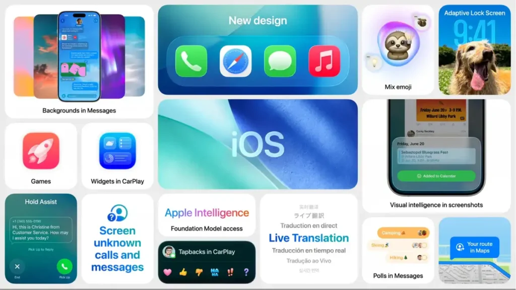
The company has officially rolled out the iOS 26.1 update, which introduces a new “Liquid Glass transparency option” and other features. This sounds like a minor detail, but it’s actually a spectacular corporate admission that their flashy new design language—the glossy, translucent user interface they pushed aggressively—was a massive, confusing failure.
The original design, while aesthetically pleasing to some designers, sparked huge backlash due to legibility concerns and user interface confusion. Apple pushed the visual flash over user function, and the users revolted.
This update isn’t about innovation; it’s about damage control. Let’s break down the design disaster, the forced retreat, and what this means for the future of Apple’s UX philosophy 👇
🎨 The Original Sin: Flash Over Function
Apple’s initial move with the new operating system was to introduce a highly glossy, translucent interface—dubbed “Liquid Glass”—which created a visually deep, almost holographic effect.
👓 The Legibility Nightmare
The new transparency effect was meant to feel premium and airy, but it quickly became an accessibility and usability nightmare.
- Visual Clutter: The background colors and app windows bled into the menus, making text, icons, and buttons difficult to read.
- User Feedback: The negative feedback was immediate and consistent: users prioritized clarity and legibility over visual depth.
- Design Arrogance: Apple’s original refusal to easily allow users to revert to a clear, opaque interface showed a familiar pattern of design arrogance—assuming their artistic vision was superior to the user’s needs.
The update is a clear signal that the company’s internal design teams failed to properly test for accessibility and basic readability.
🛠️ The Fix: Control and Transparency (The Literal Kind)
The iOS 26.1 update is a corporate walk-back, specifically addressing the legibility concerns with a new compromise.
🔄 The New Transparency Toggle
The key feature in 26.1 is the new Liquid Glass transparency option.
- User Control: This gives users more control over the glossy design, allowing them to adjust the level of transparency or potentially turn it off entirely.
- Key Features: Beyond the transparency fix, the 26.1 update also brings other key features to the iPhone, showing Apple is trying to move past the embarrassment.
This forced fix validates every single user who complained. When a design choice actively makes the device harder to use, it’s a failure of the core product.
💬 Final Thoughts — Listen to the Users
The release of iOS 26.1 is a crucial moment for Apple. It demonstrates that even the most confident tech giant must bend to user needs when a design choice fundamentally hinders functionality.
Apple’s future lies in its ability to seamlessly integrate its growing AI capabilities with a user experience that is intuitive, not frustrating. The failure of the Liquid Glass interface is a loud warning: premium design should never sacrifice accessibility.
Pravin is a tech enthusiast and Salesforce developer with deep expertise in AI, mobile gadgets, coding, and automotive technology. At Thoughtsverser, he shares practical insights and research-driven content on the latest tech and innovations shaping our world.
